Analytics Dashboard
The Dashboard is your central hub for Analytics. It provides a comprehensive overview of the Key Performance Indicators (KPIs) for all agents within your tenant.
Filtering Data
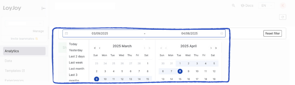
You can refine the displayed data using the global date filter. Choose from predefined timeframes (e.g., "Last month") or define a custom start and end date.
Note: Your date selection applies globally to all tabs, charts, and metrics within the Analytics view.
Visualizations & Metrics
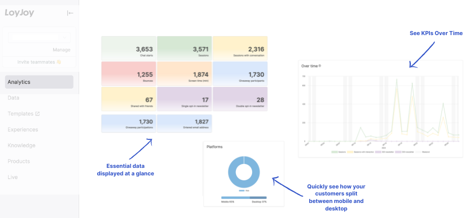
The dashboard combines high-level summary tiles with detailed trend charts to give you an immediate understanding of your performance.
💡 Tip: Hover over data points in the charts to reveal exact numbers and detailed tooltips.
1. Timeline Analysis (KPIs Over Time)
The line charts visualize how individual KPIs have developed over the selected period. This allows you to identify trends, spikes, or drops in user engagement at a glance.
2. Aggregate Metrics (Absolute Numbers)
The summary tiles display the absolute, cumulative figures for each KPI. These numbers represent the total count of events that occurred within your selected date range.
KPI Definitions
For a complete breakdown of what each metric represents and how it is calculated, please refer to our Detailed KPI Description.