Agent Overviews
While the general Dashboard gives you a tenant-wide view, the Overviews section allows you to analyze the performance of individual Agents. You can access these specifically via the left menu under "Analytics" and then click on an agent tile.
Filtering Data
Just like on the Dashboard, you can refine the displayed data using the global date filter. Select a predefined period (e.g., "Last month") or define a custom start and end date.
Note: The selected timeframe applies to all charts, funnels, and metrics within this view.

Visualizations & Metrics
This view combines high-level summary tiles with detailed charts to visualize the specific performance of the selected Experience.
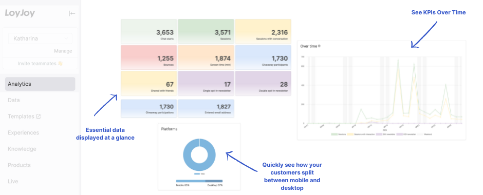
💡 Tip: Hover over data points in the charts to reveal exact numbers and detailed tooltips.
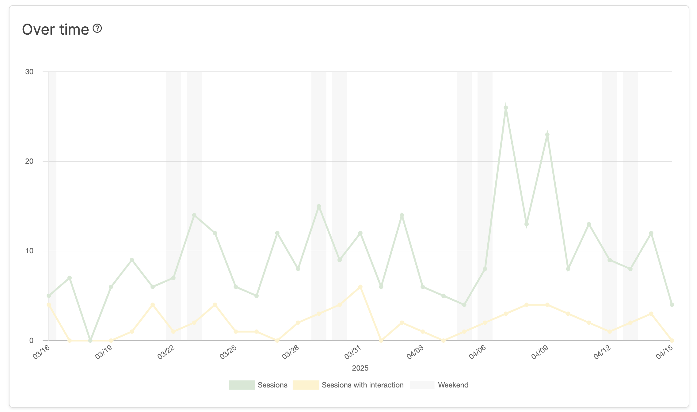
1. Timeline Analysis (KPIs Over Time)
The line charts visualize KPI trends over your specified time period. In addition to the timeline, this section provides insights into:
- The ratio of Chat Starts to Sessions.
- Usage distribution across different days of the week.
2. Key Metrics (Cumulative)
The summary tiles display the absolute, cumulative figures for each KPI. These numbers represent the total count of events that occurred within your selected date range.
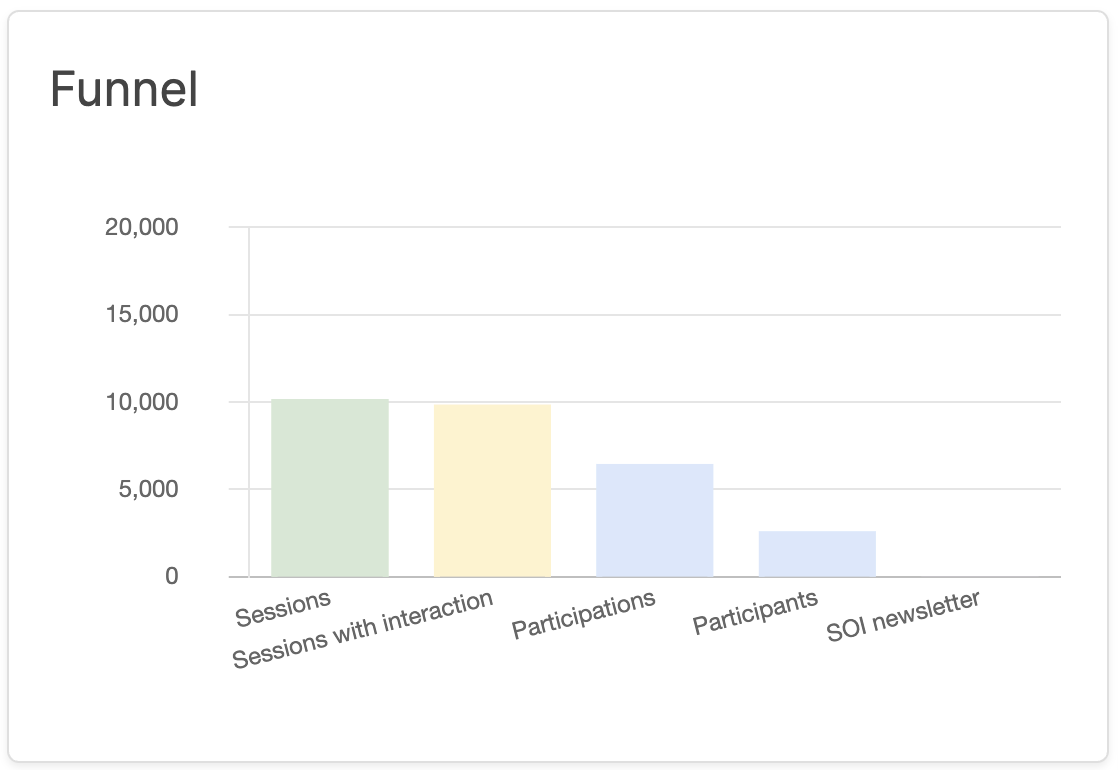
3. Conversion Funnel
The funnel visualization helps you understand user progression. It shows the drop-off rates between key steps, allowing you to identify where users are leaving the chat.
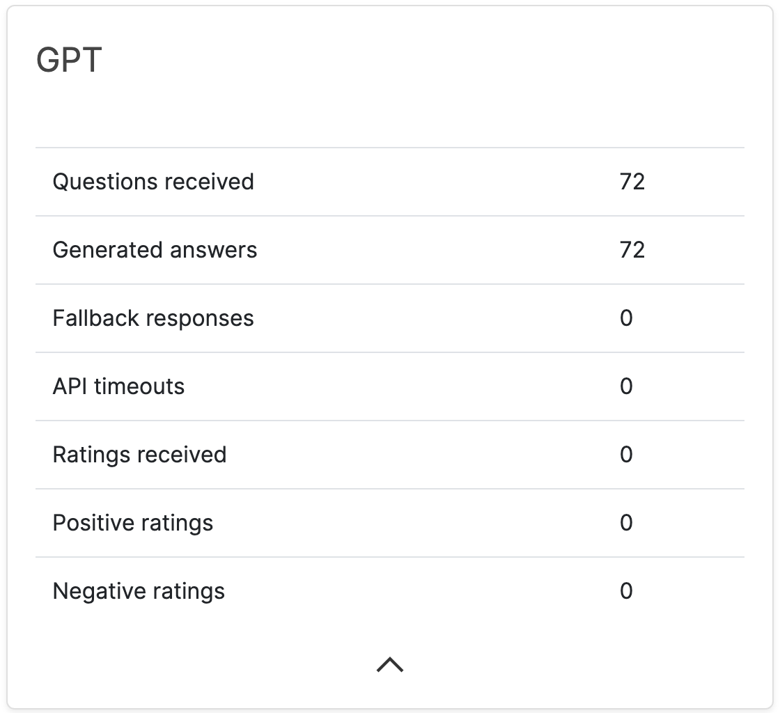
4. AI Performance
This section provides specific metrics regarding the Artificial Intelligence within your agent, such as how often the AI was triggered and how effectively it handled requests.
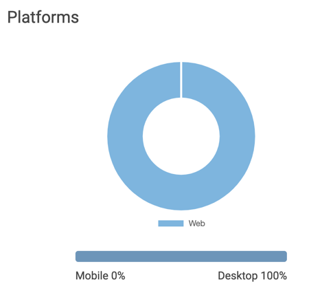
5. Platform & Device Breakdown
Here you can analyze the distribution of your users across different channels and devices.
- Channels: Shows whether users accessed the chat via Web, WhatsApp, or Facebook Messenger.
- Devices: Shows the ratio of users on Mobile devices versus Desktop PCs.
Calculation Note: These metrics are calculated based on Chat Start events (see definition). The values are displayed both as absolute numbers and as a percentage of the total chat starts.
KPI Definitions
For a complete breakdown of what each metric represents and how it is calculated, please refer to our Detailed KPI Description.