Analytics 📈
Under navigation item Analytics you find the analytics section.
Introduction
Track the performance of your live experiences, better understand your customers' behavior and see your Key Performance Indicators (KPIs) skyrocket by using the LoyJoy Analytics Dashboard.
Analytics
Once you are in the Analytics tab, you can find your aggregated, tenant-wide KPIs under Dashboard at the top of the page and the performance of the individual experience in the view in the respective folders. By clicking on the chart icon, you can easily access the KPIs of each experiece. If you click on the bell icon, you can sign up (or unsubscribe) for a weekly report by email on the performance of each experience.

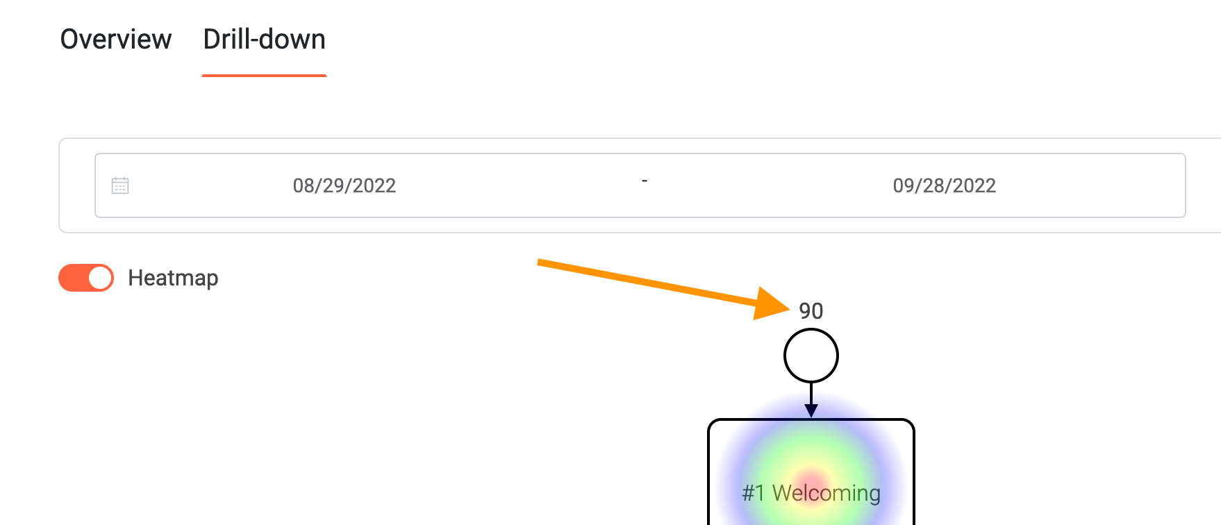
There are two tabs in this view: Overview & Drilldown. The Overview tab shows data such as KPIs and general charts for this experience. The Drill-down tab shows the heatmap depicting which BPMN process modules were visited how often and allows you to click on each module to analyze module-specific data.
Essential Data Displayed
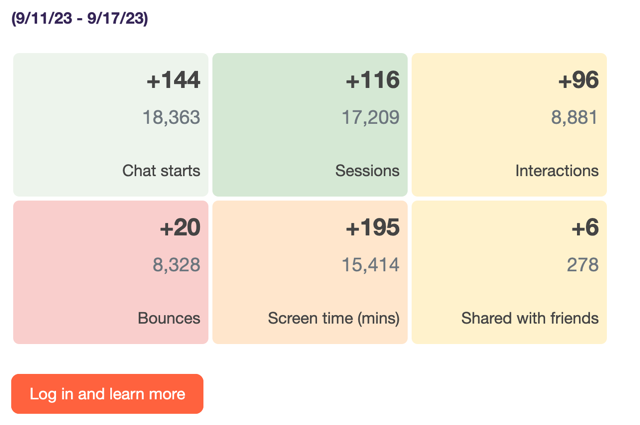
Here you get the most important numbers in a brief overview with colorful tiles (Tip: Hover over them to get more detailed information). You can select here for which period the data should be displayed. The selection will affect all tabs and views.

Essential data displayed includes:
- Chat starts (A customer has received the first message from an experience; chat starts are recounted individually for each experience)
- Sessions (A session is started when a customer receives messages from an experience; after 30 minutes a new session is counted)
- Sessions with conversation (counted as soon as the customer interacts, e. g. clicks a button)
- Bounces (counted when customer has neither typed anything in the chat nor clicked on a button)
- Screen time (Total screen time spent by all customers within this experience in minutes)
- Live Chats
- Total handling time
- Average handling time

Advanced Data Displayed
Advanced data displayed includes:
- Asked for Web push
- Single/Double opt-in
- Shared via Facebook/email/native/Twitter/WhatsApp
- Participations
- Net Promoter Score
Good to know: When you move the mouse over the tiles, a short description is displayed.
Visualization
Data can be also viewed visualized. For detailed descrioption see The KPI tab in detail 📈
KPIs Over Time
- In this chart you can view the individual KPIs over the specified time period or over the entire time period
KPIs Over Time Cumulated
- In this diagram you can view the individual KPIs cumulatively over the specified time period or over the entire time period.
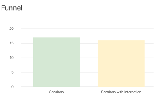
Funnel
- Here you can see the individual KPIs in a funnel.

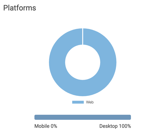
Platforms
- Here you can see how your customers are split between mobile and desktop.
- These events are counted for each time the experience is started (chat start events).
- The users are categorized into either mobile or desktop based on the user agent.

Further Illustrations
Log-in attemps with code: shows how often the log in attempt with code worked and how often it did not.
Data entered by customers: see what data has been entered by customers, such as the postal addres.
NPS visualization
NPS segments: shows the distribution of detractors, passives and promoters
NPS distribution: see the NPS scores per score.
NPS answers: Download the answers (typed content) of the customers in the NPS rating here. You can choose between the three categories detractors, passives and promoters.
Starts
Here you can see the absolute numbers of all experience starts in one table (in the overall overview "Dashboard"). This number is the same one you can see here in the drill-down:
