Product Gallery Module
Introduction
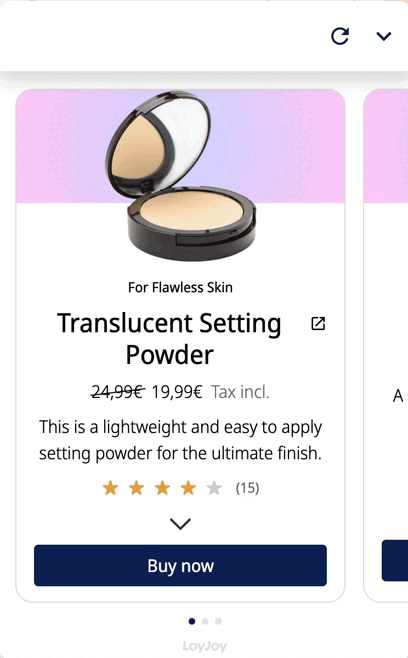
Present your products to customers in a variety of ways. Give a product description, the price or a consumer rating together in one gallery. Animate your customers to buy your product by embedding a link behind the “Buy now” button.
Typical Use Cases
Useful to integrate into your experience to show your products or services. Multiple products will be shown in a gallery slider. Use this module to present personalized product offerings as e.g. skin care routines with your products or to show the variety of your services.
How to Use the Module
Add product
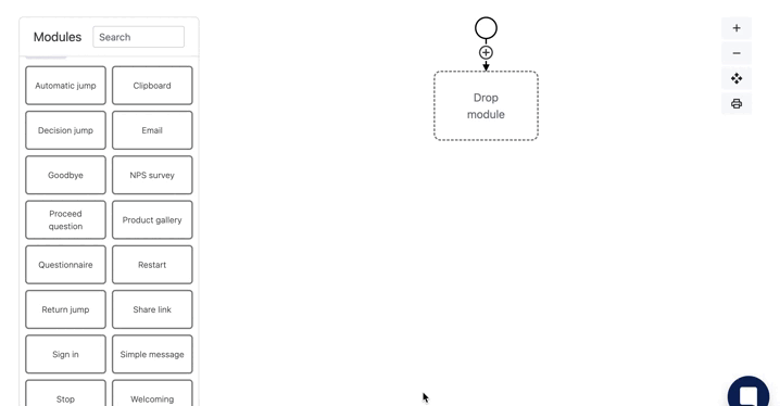
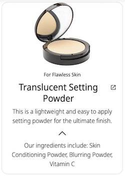
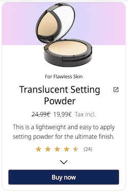
Start by inserting the module into your editor and add one or multiple products as seen below.
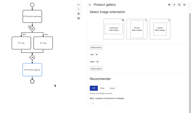
Product image
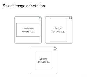
Start by choosing an image orientation at the top of the products. The orientation refers to all products equally. Continue by adding a picture according to the px size you have picked above. Remember that we do not recommend your pictures be no larger than 500 KB in order to ensure a quick loading.
Input fields
Fill in the fields you think are important. Let’s start with essential input fields such as the product name, the product description, and the product link. You can see below how this information is placed. The link enables your customers to click on the product in order to get to your website.
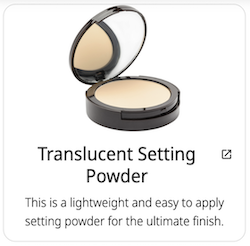
All other input fields are optional. But let us give your customers a little more information with the topline and the fold-out text. Our product presentation is coming together as you can see below.
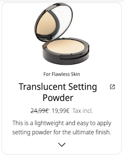
Give price details
If you want to include price details in your product gallery, you can do so by entering the price and the currency into the input field. If you want to highlight that the product is on sale, you can enter the pre-sale price into “Compare at price” field. For additional information such as included Taxes, enter the information into the “Price details” field.
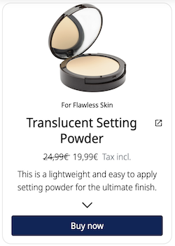
Add a Button
You can add a button to the product. This button can also link to the product URL and give an animation for the customer to “Buy now”. The button is also able to set a variable in case you want to use the product selection in your experience's flow later on.
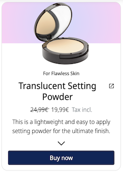
Background
Add a background image or choose a color that will be shown in the background.If you add an image and a color for your gradient, only the gradient will be shown. Remember that both the Outer and Inner Gradient Colors have to be chosen in order to appear in the product background. Down below we have added a color gradient.
Ratings
Lastly, you are able to add rating stars to your product. First enter the number of ratings on the product and then the number of stars between 0 and 5. The rating can also link to a page where the ratings can be viewed.
Using the Recommender
The recommender feature is a powerful tool that helps you provide the most relevant products to your customers. You can filter your products in different ways to enhance the shopping experience.
Enabling the Recommender
To activate the recommender, follow these steps:
- Navigate to the Product Gallery Module.
- Scroll down to the bottom of the page.
- You will see three options: Off, Filter, and Smart. By default, the recommender is turned off.
Configuring Tags
To make the most of the recommender, you need to incorporate tags into your chatflow. Here's how you can do it:
- When creating your chatflow, add relevant tags to it using the Tag Module. This helps the recommender understand user preferences.
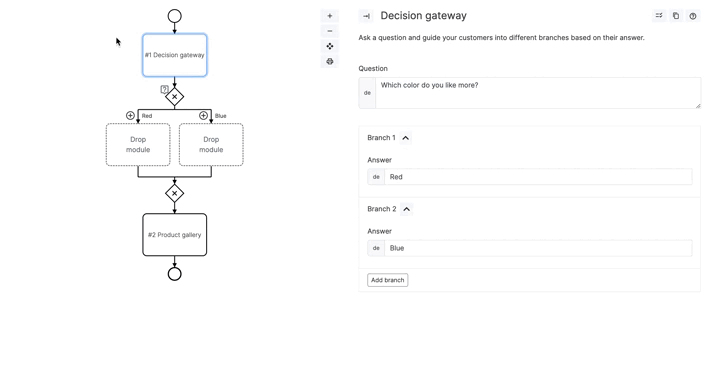
- Next, you need to associate tags with your products. This can be done in the "Tags" section under your product settings. The section will only be portrayed if you select Filter or Smart for the recommender.
Recommender Options
The recommender offers three distinct options:
1. Off
When set to "Off," all products are displayed, regardless of the assigned tags. This option provides an unfiltered view of your products.
2. Filter
Selecting the "Filter" option displays only those products that have the exact tags assigned. No products will be shown if the tags are missing. This ensures a precise product display.
3. Smart
With the "Smart" option, products are sorted based on the number of matching tags. Products with more matching tags are displayed first, offering a personalized shopping experience.